Chapter 7 Activity Budget
When is the animal active and/or inactive? Use the following script to answer research questions like:
- Nesting/Incubation behavior
- Roosting times
- Foraging times
- Mortality detection
7.1 Load settings
# load celltracktech library
library(celltracktech)

# set significant digits
options(digits = 10)

# Specify the path to your database file
database_file <- "./data/Meadows V2/meadows.duckdb"

start_time <- as.POSIXct("2023-09-01 00:00:00",tz = "GMT")
stop_time <- as.POSIXct("2023-09-02 00:00:00",tz = "GMT")7.3 Tag Activity
# selected_tag_id <- "2D4B782D", # SWSP (swamp sparrow) - Power Tag

# select a specific tag, below is a Power Tag on a Northern Waterthrush (NOWA)
selected_tag_id <- '614B661E'

# subset detection_df dataframe to only included the selected_tag_id
tag_dets <- subset.data.frame(detection_df, tag_id == selected_tag_id)

# sort the rows by time, ascending
tag_dets <- tag_dets[order(tag_dets$time, decreasing = FALSE), ]

tag_beep_interval <- 13 # seconds, will need to know of tag type beep intervals

# calculate tag activity - this turns the number of detections into a single value for a 5 min bin for each Node
tag_activity <- calculate_tag_activity(tag_dets, tag_beep_interval)

# calculate average tag activity
avg_tag_act <- calc_avg_activity(tag_activity, start_time, stop_time)

# set start and stop times for the plots (next section)
plot_start_time <- as.POSIXct("2023-09-01 06:00:00", tz = "GMT")
plot_stop_time <- as.POSIXct("2023-09-02 06:00:00", tz = "GMT")
7.3.1 Scatter Plot of RSSI vs time by Node
ggplot(data = tag_dets) +
  geom_point(aes(x = time,
                 y = tag_rssi,
                 colour = node_id),
             shape=1) +
  xlim(plot_start_time, plot_stop_time) +
  ggtitle(paste("Detections", selected_tag_id)) +
  xlab("Time (UTC)") +
  ylab("RSSI (dBm)") +
  classic_plot_theme()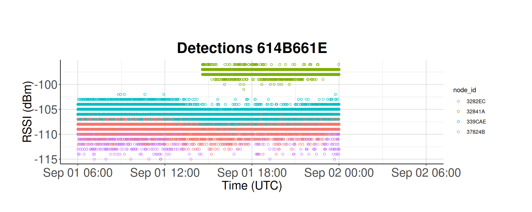
Here we see that this bird was spending most of the time in the vicinity of nodes 3282EC, 339CAE, and 37824B, but the strongest detections are near node 32841A.
7.3.2 Scatter Plot of activity vs time by Node
Next we will quantify the activity level. Activity is an arbitrary variable; it can be movement, roosting, a specific behavior, etc. You will need to define what activity is based on your study.
ggplot(data = tag_activity) +
  geom_point(aes(x = time,
                 y = abs_act,
                 colour = node_id),
             shape=1) +
  ggtitle(paste("Detections", selected_tag_id)) +
  xlab("Time (UTC)") +
  ylab("Activity (Arb. Units)") +
  xlim(plot_start_time, plot_stop_time) +
  classic_plot_theme()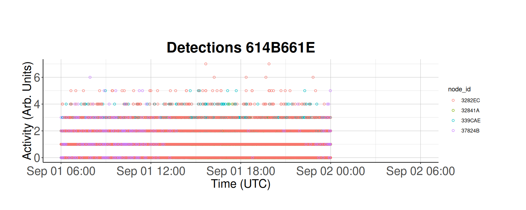
Here we see the activity level (y-axis) for every 5 min from September 1 to September 2. Each color represents a unique Node ID. From a brief glance, this tag had low to mid activity levels near nodes 3282EC and 37824B, but it is still difficult to discern what is going on in this plot.
7.3.3 2D Histogram of Activity over Time
We can summarize the above plot even further by creating a heatmap. The code chunk below creates a heatmap bin plot, which displays the activity for an individual over a period of time, with the color of each bin representing the count of activity (on a log scale), while the bins tell us the activity level.
my_breaks <- c(1, 10, 100, 1000, 10000)

ggplot(data = tag_activity,
       aes(x = time,
           y = abs_act)) +
  geom_bin2d(binwidth = c(3600, 1)) +
  xlim(plot_start_time,
       plot_stop_time) +
  scale_fill_viridis_c(name = "Counts",
                       trans = "log",
                       breaks = my_breaks,
                       labels = my_breaks) +
  xlab("Time (UTC)") +
  ylab("Activity / Hour (Arb. Units)") +
  classic_plot_theme()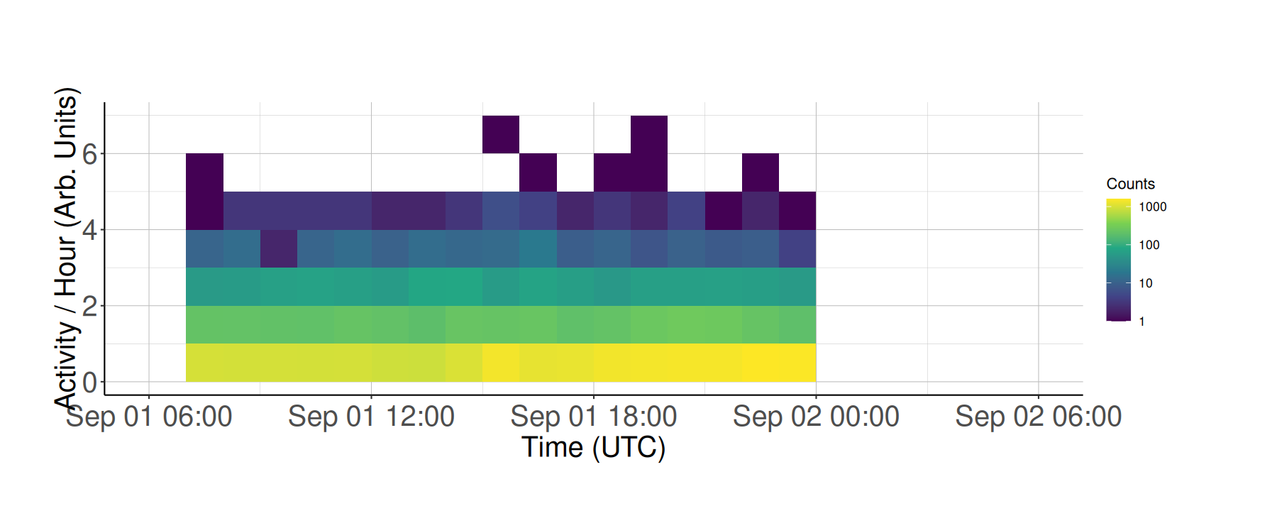
From this plot, we can see that there are multiple instances of low activity (demonstrated by the yellow bins at activity/hour 1), and fewer instances of high activity (demonstrated by the blue bins at activity/hour 4 and above).
7.3.4 2D histogram of activity vs time WITH avg activity
This code chunk makes the same plot as above, but also displays the average activity level as a red line.
ggplot(data = tag_activity,
       aes(x = time,
           y = abs_act)) +
 geom_bin2d(binwidth = c(3600, 1)) +
  geom_line(data = avg_tag_act,
            aes(x = time,
                y = avg_activity),
            colour = "Red") +
  geom_point(data = avg_tag_act,
             aes(x = time,
                 y = avg_activity),
             colour = "Red") +
  xlim(plot_start_time,
       plot_stop_time) +
  xlab("Time (UTC)") +
  ylab("Activity / Hour (Arb. Units)") +
  scale_fill_viridis_c(name = "Counts",
                       trans = "log",
                       breaks = my_breaks,
                       labels = my_breaks) +
  classic_plot_theme()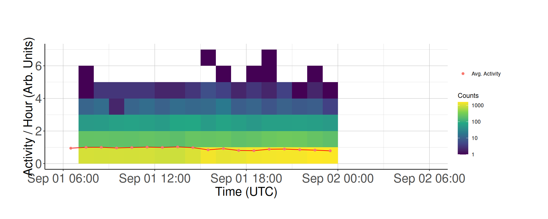
Here we see the average activity level for this tag is roughly 1 per hour from September 1 to September 2.
7.3.5 Avg activity / hour Vs time.
Let’s zoom in and isolate the average activity per hour:
ggplot(data = tag_activity) +
  geom_line(data = avg_tag_act,
            aes(x = time,
                y = avg_activity),
            colour = "Red") +
  geom_point(data = avg_tag_act,
             aes(x = time,
                 y = avg_activity),
             colour = "Red") +
  xlim(plot_start_time, plot_stop_time) +
  xlab("Time (UTC)") +
  ylab("Activity / Hour (Arb. Units)") +
  scale_fill_viridis_c(name = "Counts",
                       trans = "log",
                       breaks = my_breaks,
                       labels = my_breaks) +
  classic_plot_theme()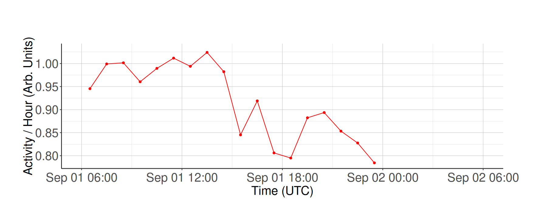
We see that average activity is highest between 6am-12pm but decreases suddenly after that, which is what we would expect for bird activity level in September.